Originally, we encountered something very similar to this pair of curves when we were
plotting the course of the early stages of the AIDS epidemic during the late 1980s.
Purple was the number of doctors working and green was the number of adults who
were displaying symptoms of AIDS as opposed to being HIV positive.
Unfortunately, AIDS had and has powerful economic effects as well, so measures like
employment, exports and educational achievements all followed the purple curve.
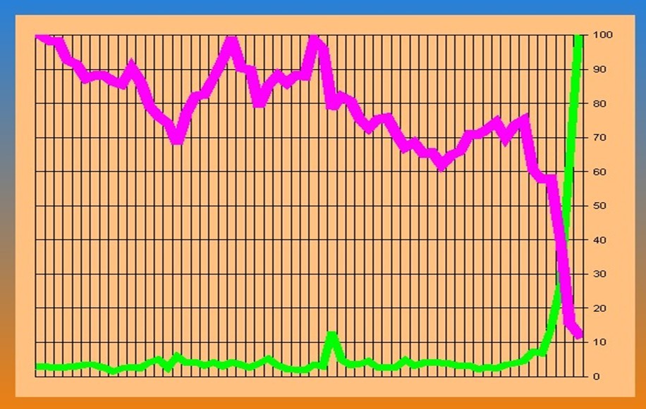
The particular example is actually shares traded (green) versus share price (purple) for
Lehman Brothers (stock symbol LEH) in 2008.
plotting the course of the early stages of the AIDS epidemic during the late 1980s.
Purple was the number of doctors working and green was the number of adults who
were displaying symptoms of AIDS as opposed to being HIV positive.
Unfortunately, AIDS had and has powerful economic effects as well, so measures like
employment, exports and educational achievements all followed the purple curve.
The particular example is actually shares traded (green) versus share price (purple) for
Lehman Brothers (stock symbol LEH) in 2008.